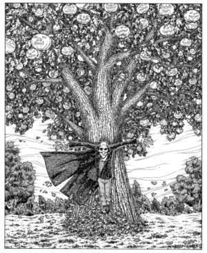
Over the last couple of days I’ve been posting photos on my tumblr and instagram accounts showing the progress I’ve been making on the first image for my planned series of illustrations based on Ray Bradbury’s The Halloween Tree.
This image is probably the most daunting of the entire series, for a number of reasons. I needed to set the tone for the entire series, and while my first inclination was to go with the quick, rough style I’ve been using over the last few months on various other projects, I wasn’t sure it would get me the effect I wanted with this project. One thing I knew for sure, if I wasn’t happy with the finished piece, I would forever be tempted to go back and do it again. So I had to make sure that whatever direction I chose had to feel like the Right Way to Do It. I ended up going with a more realistic style, that draws more on the influence of Berni Wrightson, Art Adams, and Franklin Booth, which is how I always imagined this project looking, BUT which makes me nervous because, come on. Those are some pretty high standards.
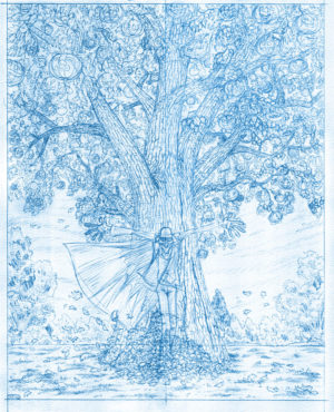
I’m generally okay with designing organic natural elements when they’re viewed from a distance, or are in the background and can be done in shorthand, but when the primary element of an image is this gigantic tree festooned with jack-o-lanterns, that makes me more than a little nervous. Especially once I realized that I was trying to make it so much more detailed and plausible than so much of my other more recent work. It took me about a week to get up the nerve to begin inking the piece, and only after doing several studies on printed copies of the pencils did I finally put pen to paper.
This series of images shows the progression from initial pencils to where the image currently sits, about 1/3 inked. I’ll continue taking photos along the way to completion. Hope you like it! ↓ Read the rest of this entry…